

Navalia renews its visual identity for its tenth edition
The brand aims to get align with the sector's evolution toward digitalization, sustainability, and international cooperation
Navalia, the leading meeting point for the shipbuilding industry in Spain and one of the sector's most important international events, presents its new visual identity to coincide with its tenth edition and twenty years of operation, given the event's biennial nature. This rebranding represents a step forward in consolidating Navalia brand as a global benchmark, combining tradition and modernity in a renewed, more versatile image adapted to the digital environment.
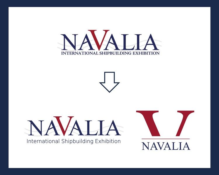
Since its inception, Navalia has projected a solid, professional identity linked to maritime sector values: innovation, reliability, and international reach. With this update, organizers sought to evolve its image without breaking with its history, maintaining the most recognizable elements of its identity, such as the central red "V" (for Vigo and naval (shipbuilding)), the serif typography, and the wavy lines evoking the sea, while giving them a cleaner, more balanced, and contemporary aesthetic.
The result is a brand that conveys both continuity and renewal, aligned with the evolution of the shipbuilding sector itself towards digitalization, sustainability, and international cooperation. Thus, the new image maintains the name NAVALIA as the central element, in a classic but optimized typeface, with greater legibility and proportion. The red “V” remains the symbolic and visual axis of the design, providing dynamism and differentiation. The three wavy lines that run through the logo represent the sea and movement, but also the interconnection between the different areas of the shipbuilding industry (construction, technology, and innovation). Their stroke has been refined for greater fluidity, providing a sense of lightness and visual continuity. The subtitle “International Shipbuilding Exhibition,” in navy blue and with a more modern and clean style, reinforces the global character of the fair.
Digital version: a strategic and necessary adaptation
Along with the new main logo, Navalia has developed a specific version of the logo for digital formats, designed for use on social media, web platforms, and mobile applications. This more vertical and compact design retains the brand's distinctive features—the red "V" and the institutional typography—but introduces a simplified composition with a visual treatment that facilitates readability in small spaces and on screens.
A horizontal red line separates the symbolic initial from the full name, providing balance and visual hierarchy. This format reinforces brand consistency across all environments, ensuring its recognition on large trade fair displays as well as in icons and digital profiles.
A visual identity ready for the future. According to the exhibition's director, Javier Arnau, "This update to our visual image symbolizes Navalia's maturity and its projection into a new stage. We maintain our essence, but we take a step forward to better connect with an increasingly digital, global, and demanding audience," says Arnau. Thus, the trade fair seeks to reinforce its role as a benchmark for business and technological exchange within the naval industry, projecting an image that reflects the values of progress, sustainability, and innovation.